Case studies
What Is UX, and How Does UX Thinking Show Up in a Portfolio?
Learn what UX means in practice and how junior designers can make UX thinking visible inside a portfolio case study.

Ömer Arı
8 min read
Most UX definitions start in a useful place, then quickly become too broad to help with portfolio writing. User experience is about how people experience a product while trying to reach a goal. That definition is fine for a glossary. For a junior designer writing a case study, the better question is more practical: where does UX thinking actually show up in the work?
This article is for junior designers, bootcamp graduates, and early product designers who understand the basic idea of UX, yet struggle to show it in a portfolio. By the end, you will know how to move from saying “I did UX” to showing the reasoning behind your design decisions.
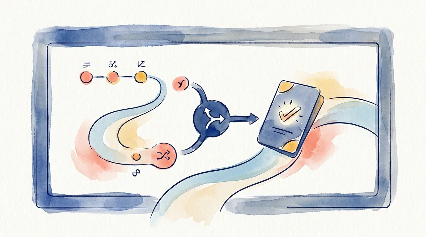
UX in practice means problem, decision, and effect
A practical definition of UX is simple: understand the problem people face, make design decisions that respond to that problem, then check how those decisions change the experience.
That gives you three useful parts: problem, decision, and effect. UX thinking becomes visible in a portfolio when those parts connect. A list of process steps does not create that connection on its own.
For example, “I conducted user research” describes an activity. A stronger version answers a more useful question: what did you learn, and how did that learning change the design?
The same applies to wireframes. “I created wireframes” describes an output. A stronger version explains what uncertainty the wireframe helped you explore. “I built a prototype” is also too general on its own. The important part is the question the prototype helped answer.
This is why UX should not read like a task list in your portfolio. It should read like a chain of decisions.
A simple chain can look like this:
- What problem was the user facing?
- What evidence helped you notice that problem?
- What solution options did you consider?
- Which decision did you choose, and why?
- How did that decision change the experience?
These five questions can give a junior case study a clear structure. You do not need to show a perfect end-to-end process. You need to make your thinking easy to follow.
Why saying “I did UX” is not enough
In a portfolio, “I did UX” is usually too broad. UX can include research, flow design, wireframes, prototypes, usability testing, accessibility, content design, analytics, and more.
The reader wants to understand what you did and why it mattered. A process diagram alone rarely answers that. A diagram may show research, ideation, design, and testing. The reader still needs answers to specific questions:
- What was the real problem in this project?
- What role did you play?
- Which decisions did you make?
- What evidence supported those decisions?
- What changed because of the work?
This is why UX thinking becomes stronger through decisions, not through process labels.
Many junior case studies follow a familiar order. They start with a problem, then show research, personas, a journey map, wireframes, and final screens. That structure can be useful. It can also create a weak reading experience when the reasons behind the work are missing.
This is the risk of process theater. The case study looks like it followed a UX process, yet the process does not seem to produce clear decisions.
A simple way to fix this is to bring each section closer to this idea:
This finding led to this decision.
You do not need to use that exact sentence every time. The logic should be visible across the case study.
For example:
“During interviews, users said they compared delivery cost late in the checkout flow. I moved delivery cost earlier into the order summary so users could make that decision before entering payment details.”
This sentence connects activity, evidence, and decision. The reader can see how the designer thought, not only what the designer produced.

Four signs of UX thinking in a portfolio
You do not need a large research project to show UX thinking. Smaller student projects, redesigns, and personal projects can still show strong signals. Four signs matter most.
1. Problem framing
Problem framing means you do not start the project with “I designed an app.” You explain the user problem, product goal, or experience gap that shaped the work.
Weak version:
“I designed a food delivery app.”
Stronger version:
“Users needed a faster way to reorder during busy hours. This project focused on reducing the steps required to repeat a previous order.”
The second version is not only about designing an app. It frames a specific experience problem.
2. Evidence
Evidence shows that your decisions were not based only on personal taste. Evidence does not always need to be a large research study. It can come from user interviews, usability tests, support tickets, analytics, competitor review, instructor feedback, or direct observation.
The key is to connect the evidence to the decision.
Weak version:
“Users found the app confusing.”
Stronger version:
“In testing, 3 out of 5 users looked for the address change option during payment. I moved address information above the payment summary so it could be reviewed before checkout.”
The sample size may be small. The decision still becomes clearer because the evidence is visible.
3. Decision rationale
Decision rationale explains why a design decision was made. Final screens do not explain this by themselves. The reader can see the screen, yet still miss the reason behind it.
For each important screen, ask yourself:
“What decision matters here?”
The answer might be visual, such as color, type, or icon use. More often, it is about information order, flow, error handling, empty states, filtering logic, or the amount of control given to the user.
For example:
“I kept the cart summary fixed near the top of the page because users kept testing coupons without seeing the total price change.”
That sentence connects a UI decision to a UX reason.
4. Trade-off awareness
A trade-off means you understand what you gave up when you chose one direction. Junior portfolios often miss this. When every decision is presented as the obvious correct answer, the case study can feel thin.
A stronger explanation might sound like this:
“A single-page checkout looked faster at first. During error handling and address editing scenarios, it reduced user control. I kept the checkout short, then separated the moments where users needed to review or change critical information.”
This shows more than a nice solution. It shows that you considered constraints and alternatives.
How to apply this to a junior project
Your project may be small. It may be a bootcamp project, a personal redesign, a volunteer project, or a concept study. You do not need a full product team behind the work to show UX thinking. You need to make your decisions easier to trace.
Use this checklist:
- Add a one-sentence problem statement at the start.
- Show at least one piece of evidence in each major section.
- Write the reason before showing the final screen.
- Explain at least one alternative you rejected.
- End with what you learned or what you would test next.
Here is a small example:
“At first, I assumed users would rely heavily on filters. During early testing, users checked stock and delivery information on product cards before using filters. I kept filters available, then made stock and delivery details more visible on the card.”
This paragraph is useful because it connects assumption, evidence, and decision.
Here is another example:
“My first version placed the whole sign-up flow on one screen. After testing, I noticed that showing multiple error messages at once made the flow harder to recover from. I split the flow into two short steps and kept only one key decision on each screen.”
Again, the UX thinking appears through a change in the decision, not through a process label.
What to do next
Open one of your existing case studies and review only four things: problem framing, evidence, decision rationale, and trade-off awareness.
For each major section, ask:
“Am I only saying what I did, or am I also showing why I made that decision?”
If the section only says what you did, add one decision sentence. The simplest format is:
“I noticed this. So I made this decision. That changed the experience in this way.”
You do not need to rewrite the full case study in one pass. Start with the three most important screens or flow moments. For each one, write the reason behind the decision before you show the final output. That is where UX thinking starts to become visible in a portfolio.
This article was created in collaboration with AI · Editor: Ömer Arı
Related reading
Mar 11, 2025
4min read
How to Turn a Bootcamp Project Into a Strong UX Case Study
Learn how to turn a bootcamp UX project into a stronger case study by adding context, constraints, decisions, and realistic trade-offs.
Apr 22, 2026
7min read
UX vs UI: Why Final Screens Are Not Enough in a Portfolio
Learn the practical UX vs UI difference in portfolio writing, and how to make design reasoning visible beyond polished final screens.
Apr 14, 2026
3min read
A Simple UX Case Study Outline That Hiring Teams Can Skim
Use this outline to make your portfolio case study easier to scan without turning the project into a shallow template.