Case studies
Anatomy of an interview-ready UX case study
The same UX case study written twice, section by section. See why the weak version fails a hiring manager's scan and what makes the strong one work.

Ömer Arı
12 min read
I review UX portfolios every week, as a design lead who hires and as a mentor. The pattern I see most often is painful because of how avoidable it is: a designer who clearly did solid work, presented in a case study that hides everything a hiring manager is trying to find.
The work is rarely the problem. The story is.
Part of the blame sits with the format we all learned from. Behance taught a generation of designers that a case study is a poster: a gorgeous, endless scroll of full-width visuals, presented like evidence. For visual craft, that format is honest; the artifact speaks for itself. But product design case studies inherited the poster wholesale, and the inheritance quietly deleted the one thing a product hiring manager scrolls looking for. A poster can show what you made. It can’t show what you decided, what the decision cost, or what you’d defend in a room. And because everyone publishes in the same mold, the mold has started to look like a proven rule rather than what it is: a habit borrowed from a different job.
To show you exactly what I mean, I’m going to do something a little unusual. Below is the same case study written twice. Maya, the designer, is a fictional teaching example I use in my mentoring practice, and both versions of her project are constructed. But every mistake in the first version is one I’ve seen in real portfolios, many times, from designers whose work deserved better. The project itself is deliberately ordinary: an e-commerce product page redesign, the kind of case study half the portfolios I review are built on. If the approach works here, it works anywhere.
We’ll go section by section. For each one: the weak version, why it fails in the three seconds a reviewer gives it, the strong version, and what actually changed.
1. The problem section: numbers are load-bearing
Before:
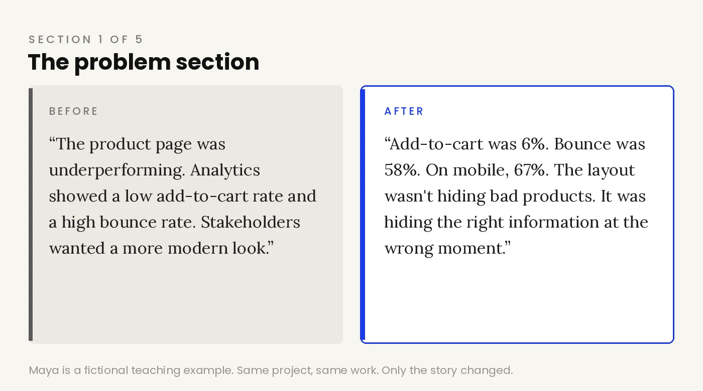
“The product page was underperforming. Analytics showed a low add-to-cart rate and a high bounce rate, especially on mobile. The page design was also outdated compared to competitors, and stakeholders wanted a more modern look.”
Why this fails: “Underperforming” and “outdated” are opinions. A reviewer can’t tell whether this project mattered, and worse, “stakeholders wanted a modern look” quietly hands the problem definition to someone else. It reads like the designer executed a request rather than owned a problem.
After:
“Marlo’s PDP had a conversion problem. Analytics over a rolling quarter showed an add-to-cart rate of 6% and an overall bounce rate of 58%. On mobile, bounce climbed to 67%. […] The layout wasn’t hiding bad products. It was hiding the right information at the wrong moment.”
What changed: The numbers do two jobs at once. They establish stakes without adjectives, and they set up the results section before it arrives. Notice also that the problem is framed as a specific diagnosis about information and timing, which the entire redesign will then answer. A problem statement is a promise about what the rest of the case study will prove.
In my weekly reviews, the two most common stand-ins for a real problem are a scope statement (“the goal was to redesign the product page”) and a missing feature dressed up as a problem (“the app didn’t have X, so it needed X”). Both skip the same questions: what was breaking, for whom, and how badly? A quick self-test: if your problem section would read exactly the same had the project never happened, it’s describing an assignment, and a reviewer can tell.
2. The research section: findings are worthless until they point somewhere
Before:
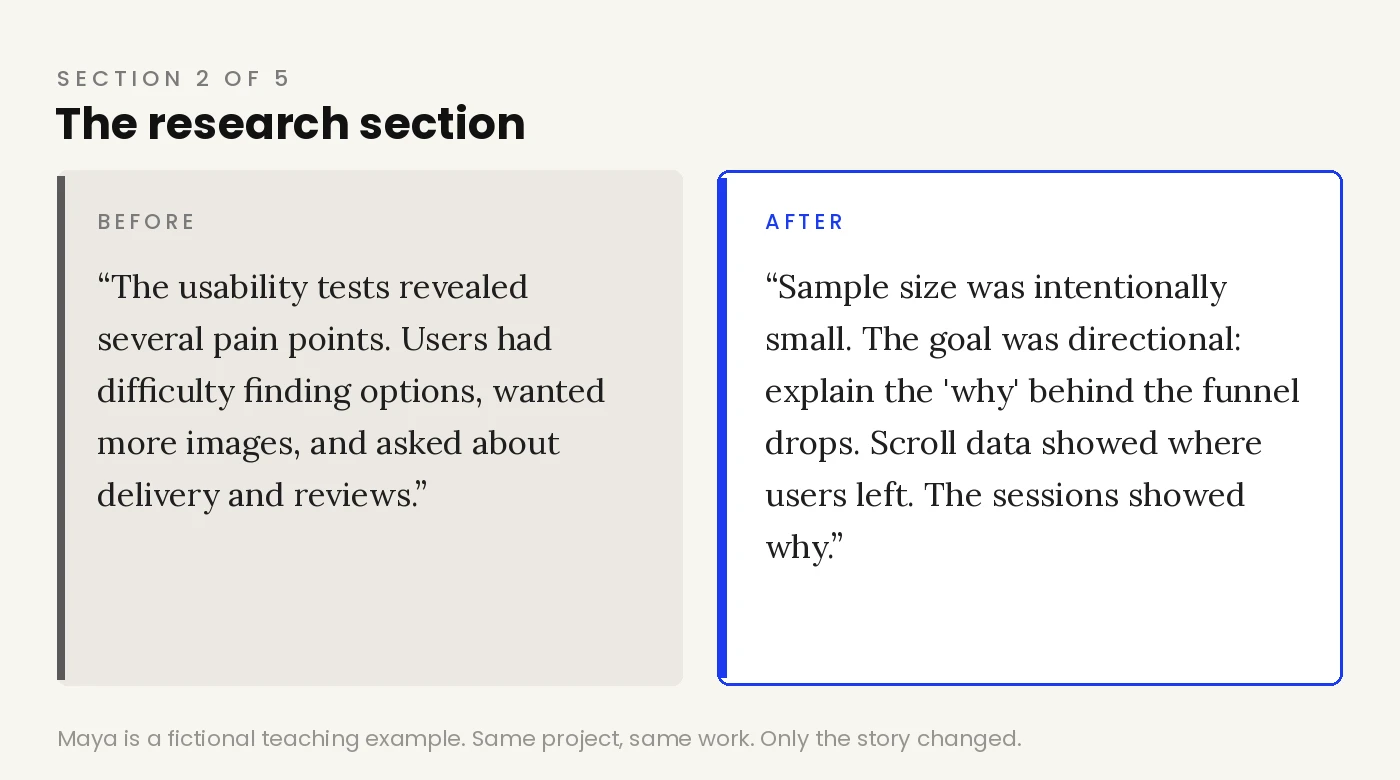
“The usability tests revealed several pain points. Users had difficulty finding color and size options, wanted more product images, and asked about delivery times and reviews.”
Why this fails: This is a list of observations, and on its own it’s fine. The failure is what’s missing around it: no sense of why these six sessions were run, what question they were answering, or what each finding changed about the design. Research presented this way is decoration. Reviewers have seen a hundred case studies where “we did usability testing” is a ritual sentence with no consequences.
The competitor benchmark is this failure’s most polished form, and I see it weekly. Candidates move fast, prototype fast, and the benchmark is the first reflex: genuinely comprehensive comparison tables, sometimes the most labor-intensive artifact in the whole case. Then the case study never states what opportunity or insight the benchmark actually surfaced, and not a single decision later in the story refers back to it. The effort was real. As presented, it’s furniture.
After:
“Sample size was intentionally small. The goal was directional: explain the ‘why’ behind the GA4 funnel drops and Hotjar scroll data, not to generate statistically representative findings. […] These three findings mapped directly onto the analytics gaps. The scroll-depth data showed users leaving before they reached variants or reviews. The usability sessions showed why they left.”
What changed: Two things worth stealing. First, the strong version defends its own limitations before anyone can attack them: six participants, and here is why six was enough for this purpose. That single move signals more research maturity than a wall of affinity-map photos. Second, every finding is wired to evidence from another source. Quantitative says where users leave, qualitative says why. Research earns its place in a case study when it’s shown doing work.
3. The process section: name your decisions, not your framework
Before:
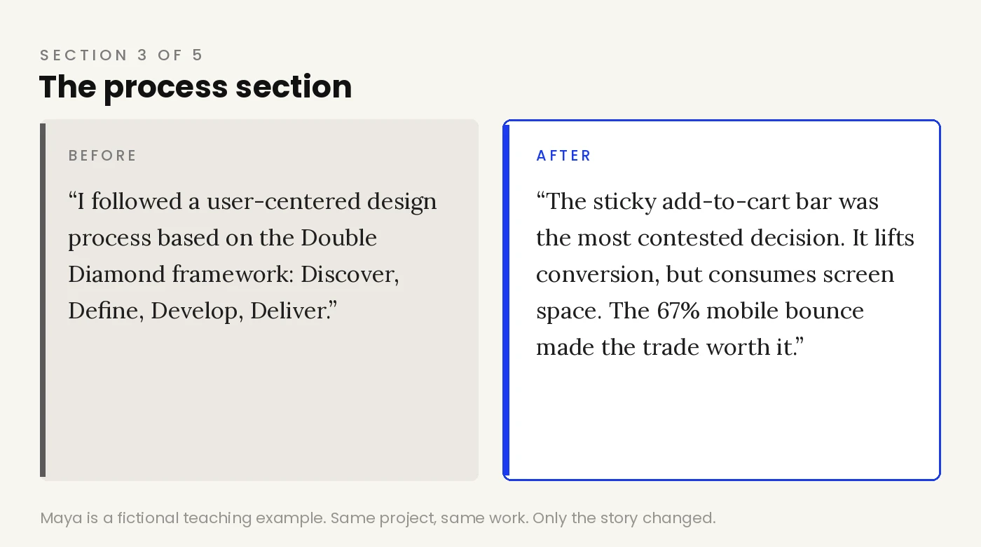
“I followed a user-centered design process based on the Double Diamond framework: Discover, Define, Develop, Deliver.”
Why this fails: Every applicant writes this exact paragraph. Naming a framework tells a reviewer what template you filled in, and nothing about how you think. In the weak version, the process section is where thinking should be, and instead there’s a diagram of a diamond.
After:
“The harder call was above-the-fold real estate. Gallery, price, variants, and trust signals all competed for the same space. I ordered them by the decision hierarchy: see it first, then choose it, then a compact trust line alongside the price. Not everything could be first. The hierarchy made the cuts defensible. […] On mobile, the sticky add-to-cart bar was the most contested decision. It reliably lifts conversion, but it consumes persistent screen space and risks feeling intrusive. The 67% mobile bounce rate made the trade worth it.”
What changed: This is the heart of the whole teardown, so let me be precise about what’s happening in the strong version. It names a conflict (four elements, one fold). It shows a reasoning tool the designer built for this specific problem (see it, choose it, trust it, buy it). It admits a decision was contested and states what tipped it. Hiring managers read case studies specifically hunting for this: evidence that when things competed, you had a way to choose, and you can defend the choice out loud in a room. One honestly narrated trade-off is worth more than an entire process section.
When I push on this in mentoring sessions and ask “why did you choose this?”, two answers come up again and again. The first is taste wearing a work badge: “I felt it was cleaner,” “I liked this direction better.” The second is sneakier: a couple of friends looked at the design, their comments got quietly promoted to ground truth, and a preference became “users found this confusing.” Neither survives the same question asked in an interview, because neither was a decision. A decision has a conflict, a criterion, and a cost you accepted.
4. The results section: vague success is indistinguishable from no success
Before:
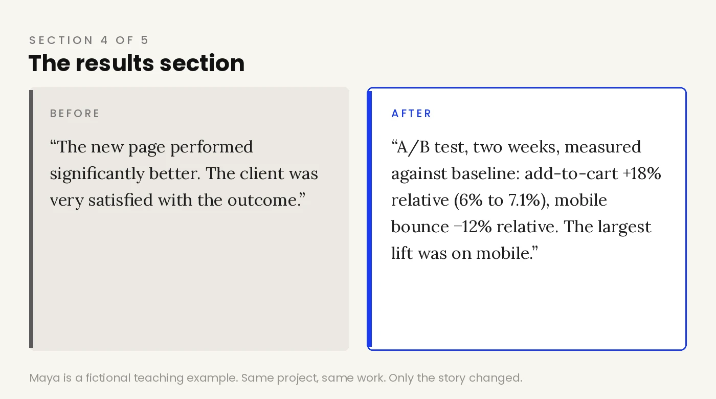
“The new page performed significantly better: the add-to-cart rate improved, mobile bounce rate decreased, and more users reached checkout. The client was very satisfied with the outcome.”
Why this fails: “Improved significantly” cannot be verified, compared, or questioned, so an experienced reviewer discounts it to zero. “The client was satisfied” is worse than nothing; approval is not an outcome. And when every metric conveniently improved with no texture, the whole section starts to smell like it was written backwards from a happy ending.
After:
“The redesign ran as an A/B test for two weeks against the original PDP. All lifts are relative, measured against baseline rates. Add-to-cart rate: +18% relative (baseline ~6%, redesign ~7.1%). Mobile bounce rate: −12% relative. […] The largest lift was on mobile, where the sticky add-to-cart bar and above-the-fold trust signals did the most work.”
What changed: The strong version shows its measurement method before its numbers, marks the lifts as relative, and gives baselines. That precision is itself the signal. It says: this designer knows the difference between +18% relative and +18 points, and won’t inflate either. It also credits specific design decisions with specific portions of the outcome, which closes the loop the problem section opened. If your real project has no clean numbers, say what you’d measure and what direction early signals pointed. Honest partial evidence reads better than confident vagueness.
5. The learnings section: platitudes are a wasted closing argument
Before:
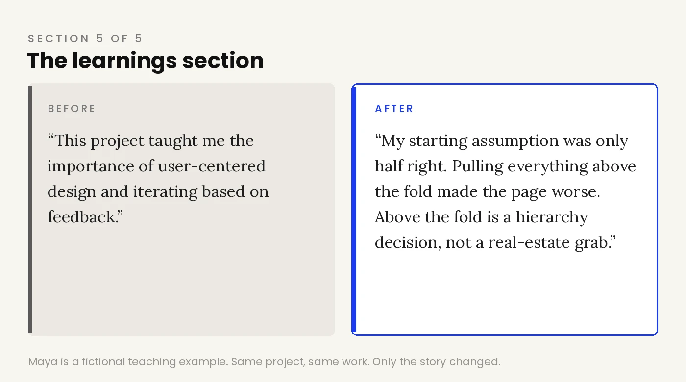
“This project taught me the importance of user-centered design and iterating based on feedback. I’m proud of how the redesign turned out and excited to apply these learnings to future projects.”
Why this fails: This paragraph could be stapled to any project by any designer in any year. A closing section that generic actively hurts, because it’s the last thing the reviewer reads before forming an opinion.
After:
“My starting assumption was that surfacing information would be enough. Get variants, reviews, and delivery above the fold, and conversion would follow. That turned out to be only half right. When I first pulled everything up, the page got crowded and tested worse. […] The lesson: above the fold is a hierarchy decision, not a real-estate grab.”
What changed: The strong version confesses a wrong assumption and shows the moment it broke. That does something no list of skills can do: it proves the designer learns from contact with reality, and it produces an insight specific enough that it could only have come from this project. A good learnings section is a portable idea the reviewer can imagine you bringing to their team.
The anatomy, in one place
If you take one thing from this teardown, take the pattern behind all five sections:
- Problem: numbers and a diagnosis, not adjectives and a stakeholder request.
- Research: findings wired to decisions, limitations defended up front.
- Process: named trade-offs and contested calls, not a framework diagram.
- Results: method before numbers, baselines with lifts, credit tied to decisions.
- Learnings: one broken assumption and one portable insight, not gratitude.
Run your own case study against these five lines. Wherever you can’t point to the sentence doing the job, that section is telling the reviewer about your activities when it should be showing your judgment.
The work in both versions of Maya’s project was identical. Same research, same design, same test. One version would get a polite pass, and the other gets the designer into the room where they can talk about it. That difference was built entirely with decisions made visible.
FAQ
What makes a UX case study interview-ready?
Visible decisions. A reviewer should be able to find a problem stated with numbers, findings that changed the design, at least one named trade-off, results with baselines, and one honest learning, all within a quick scan.
How do I write a strong problem statement for a UX case study?
State what was breaking, for whom, and how badly, with the numbers you had at the time. A useful self-test: if the paragraph would read the same had the project never happened, it’s a scope statement, not a problem.
What if my project has no metrics?
Say what you would have measured and what direction early signals pointed. Qualitative evidence presented honestly reads far better than invented precision or confident vagueness.
How much research is enough in a case study?
Enough to answer the question you name. Small samples are fine when you state their purpose and defend the limitation up front, then show each finding changing a decision.
Should I mention the Double Diamond or another framework?
You can, briefly, but a framework name carries no signal by itself. The section reviewers actually read is the one where competing options, a criterion, and an accepted cost are named.
This article was created in collaboration with AI · Editor: Ömer Arı
Related reading
Jul 1, 2026
6min read
5 moments a hiring manager quietly gives up on your UX case study
Learn where hiring managers lose interest in a UX case study, and how to fix each weak spot with clearer evidence and decisions.
Apr 23, 2026
3min read
How to Turn a Simple UX Project Into a Strong Case Study
Simple UX projects can still reveal strong design thinking. Learn how to find the story inside a smaller project.
Apr 16, 2026
3min read
Common UX Case Study Mistakes That Make Strong Work Look Weak
Avoid common UX case study mistakes that hide strong design work, from unclear roles to overclaiming impact.