Case studies
5 moments a hiring manager quietly gives up on your UX case study
Learn where hiring managers lose interest in a UX case study, and how to fix each weak spot with clearer evidence and decisions.

Ömer Arı
6 min read

A UX case study often makes complete sense to the person who wrote it. You remember the meetings, the constraints, and the reason a small design detail mattered. Your own memory fills in whatever the page leaves out.
A hiring manager does not have that memory. They open your case study with limited time and one goal: understand how you think as a designer, scanning for a problem framed, a decision made, and work connected to an outcome. When those signals are hard to find, most reviewers just stop reading.
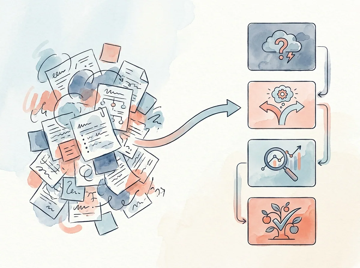
Here are five moments where a hiring manager quietly gives up, with a concrete fix for each.
1. You open with the solution, before the problem is clear
Many case studies start with a polished final UI: a clean hero mockup, a few final screens, maybe a short prototype clip. It looks confident, but the reviewer still cannot answer one basic question: what is this screen actually solving? A polished interface does not, on its own, explain the user problem or the constraint that made the project necessary.
Concrete fix: use the first two sentences to name the specific problem and the key constraint.
Instead of:
“I redesigned the onboarding flow to make it more user-friendly.”
Try:
“New users were dropping off during account setup because identity verification felt disconnected from onboarding. The team had to fix this without changing the compliance requirements.”
That opening gives the reviewer a real problem, a real constraint, and a reason the final UI exists.
2. You show a lot of process, but no real decision
Most case studies include a familiar sequence: research, personas, journey maps, wireframes, usability testing. These artifacts can take up space without revealing how a decision got made.
A hiring manager wants to see what you did with what you learned: what option you rejected, what constraint forced a choice, what you prioritized when two reasonable ideas competed for the same screen.
Concrete fix: show at least one real trade-off, and explain the reasoning behind it.
Example:
“The first concept surfaced every filter option upfront, which made the first screen feel heavy for new users. I moved the three most-used filters into the primary view and placed the rest behind a secondary action.”
This tells the reviewer you weighed usability against control and made a call based on real usage.
3. You tell the story, but do not show the evidence
Case studies often say:
“I conducted user research."
"The new flow felt more intuitive.”
These may be entirely accurate, but the reviewer has no way to see them.
Hiring managers look for proof, not a full research deck. A usability test finding or a before-and-after flow comparison can carry the same weight in far less space. What matters is the visible link between a claim and its evidence.
Concrete fix: add one piece of evidence directly under every important claim.
Instead of:
“Users were confused by the delivery options, so I improved the checkout flow.”
Try:
“In the first usability test, 3 of 5 participants confused delivery selection with payment confirmation. I moved delivery selection earlier in the flow and rewrote the step labels to separate the two.”
This version shows the observation, the response, and the reasoning behind it.
4. Your outcome is too vague to evaluate
A weak closing section can flatten a solid case study. Common outcome lines look like this:
“The experience was improved."
"Users found the new flow easier.”
These lines sound positive, but they do not give the reviewer enough to evaluate. Improved compared to what? A strong outcome does not require a business metric. Plenty of projects, including NDA-protected work, lack access to conversion data. What matters is that the outcome stays specific and honest.
Concrete fix: use a before-and-after structure, with context around any real number, or an honest qualitative result if there is no number to share.
With a number:
“The original flow moved users through six screens before payment. The revised flow reduced this to four by combining delivery review and confirmation into one step.”
Without a product metric:
“This concept did not ship, so live impact was never measured. In usability testing, participants distinguished delivery, payment, and order review more consistently after the second iteration, and that finding shaped the next version.”
The second example carries no invented numbers, and it still tells the reviewer what was learned.
5. It is unclear what you personally did
Team projects show up in most UX portfolios. What matters is what happens when your own contribution disappears inside “we decided” and “the team tested.” Hiring managers need to know what they would actually be hiring you to do: lead the research plan, design the core flow, or turn findings into the decision that shipped.
Concrete fix: add a short role summary near the top, then keep your ownership visible through the story.
Role: Product Designer
Timeline: 6 weeks
Team: 1 product manager, 2 engineers
Owned: user flow, prototype, usability test plan, design iteration
Then reinforce it in the narrative:
“After aligning with the PM on success criteria, I mapped three checkout flow options, tested the two most realistic ones, and recommended the shorter flow based on the findings.”
You are probably too close to your own case study
These five moments are hard to catch in your own work, because you already know what happened between the screenshots. A hiring manager only sees what is written and shown: the problem you were solving, the constraints that shaped the work, the decisions you made, the evidence behind them, and what you personally owned.
FAQ
How long should a UX case study be?
There is no ideal length. What matters is that the problem, constraints, decisions, evidence, and your contribution are all clearly visible.
What should I include if I do not have metrics?
Lean on qualitative outcomes: usability test findings, before-and-after flow changes, or what changed in the next iteration.
Can I write a UX case study for an NDA-protected project?
Yes. Generalize sensitive details and skip private data while still explaining the problem type, your role, and the impact.
Do hiring managers care about final UI screens?
Yes, but final screens are strongest when the problem, decision process, and evidence around them are clear.
How do I show my role in a team project?
Add a role summary near the top and keep specific ownership language through the case study.
This article was created in collaboration with AI · Editor: Ömer Arı
Related reading
May 8, 2026
10min read
How to Show Information Architecture in a UX Portfolio
How to present information architecture decisions in a portfolio through user needs, content grouping, and navigation reasoning.
May 6, 2026
9min read
How to Explain Prototyping in a UX Case Study
How to present prototypes in a UX case study through assumptions, interaction decisions, test scenarios, and learning.
May 5, 2026
10min read
How to Show a Journey Map in a UX Case Study
How to connect a journey map to user problems, friction points, and design decisions in a UX case study.