Case studies
How to Show a Journey Map in a UX Case Study
How to connect a journey map to user problems, friction points, and design decisions in a UX case study.

Ömer Arı
10 min read
Journey maps appear in many UX portfolios, but they are often under-explained.
A case study may show a polished map with stages, emotions, pain points, opportunities, and many boxes. The artifact looks complete. Still, the reader may be left with basic questions:
- What did you learn from this map?
- Which friction point shaped a design decision?
- Where did the user problem become clearer?
- What would the case study lose if the journey map were removed?
If those questions remain unanswered, the journey map becomes a decorative process artifact.
Used well, a journey map can be powerful. It helps you explain a design decision as part of a wider experience, not just as a change on one screen. It can show what the user is trying to do, where the experience breaks down, what the user needs at that moment, and where design needs to intervene.
So the goal is not to say, “I used a journey map in my UX process.”
The goal is to show:
These were the critical friction points in the user journey, and this is how they shaped the design direction.
What is a journey map?
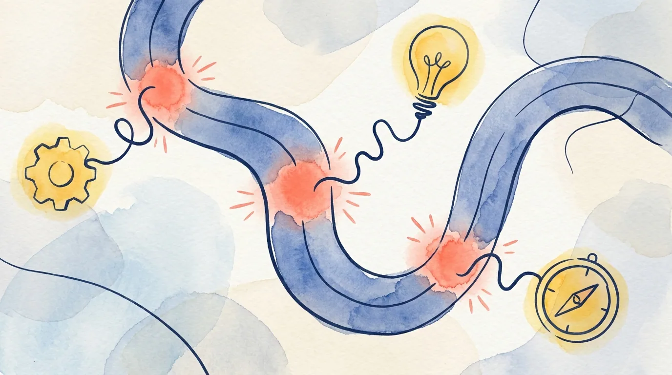
A journey map is a visual and narrative tool that shows the stages a user goes through while trying to reach a goal. It can include actions, touchpoints, needs, questions, emotions, friction points, and opportunities.
For portfolio purposes, a journey map helps answer one important question:
Is the user problem happening on one screen, or is it created across a wider flow?
This distinction matters. Some UX problems cannot be solved at the screen level alone. A user may not abandon a flow because a button is hard to see. They may leave because they do not understand what will happen at the end. A form may not feel difficult because of its length. It may feel risky because the user does not know which information can still be changed later.
A journey map helps make these wider experience problems visible.
When does a journey map help in a portfolio?
A journey map is not required in every project. It is useful when it makes the problem clearer than a screen-by-screen explanation would.
1. The problem stretches across multiple steps
If the user problem happens across several steps, a journey map can help.
For example, in an application flow, the user may not struggle on the first screen. The real issue may appear across information gathering, comparison, decision-making, and confirmation. If you only show final screens, the problem may look smaller than it was.
A journey map can show:
- Where does the user hesitate?
- What missing information affects the next step?
- Which touchpoint increases or reduces trust?
- Where should the design respond?
In this situation, the journey map strengthens the problem framing section of the case study.
2. The user’s emotional state affects the decision
In some products, users do more than complete a task. They deal with trust, uncertainty, urgency, anxiety, control, or risk.
For example, in a finance product, users may understand the steps but still hesitate if the outcome feels unclear. Similar patterns can appear in healthcare, education, insurance, travel, or public service experiences.
A journey map can help you connect the user’s emotional state to design decisions.
Weak version:
We mapped the user journey and found some pain points.
Stronger version:
The journey map showed that users could move through the flow, but their need for reassurance increased as they approached the decision point. Because of that, we did not only simplify the form. We also made cost information, next steps, and recovery options more visible before confirmation.
Now the journey map directly explains the design direction.
3. Multiple touchpoints affect the experience
Some experiences do not happen only inside an app or website. The user may interact with email, SMS, customer support, a call center, a store, a landing page, or a physical document.
In this case, a journey map helps show that the UX problem is part of a wider system.
For example:
Users started the application on mobile, but checked SMS, email, and support messages before making the final decision. The journey map showed that the trust issue did not come from one screen. It came from inconsistent information across channels.
This type of explanation shows more mature UX thinking. The problem is not reduced to interface polish.
When does a journey map weaken a case study?
A journey map can be useful, but it can also create noise.
1. It is used like a generic process template
Some journey maps are built from generic stages such as awareness, consideration, purchase, and retention. Those stages may be useful in some contexts, but they are weak if they do not reveal anything specific about the project.
The reader should understand:
- What evidence informed this map?
- What became clearer because of the map?
- Which design decision changed because of it?
Without those connections, a shorter problem flow may work better.
2. The map is too complex to read
Showing everything is not the same as explaining everything.
If the map is large and dense, the reader may spend more effort decoding the artifact than understanding your thinking. This is especially true in portfolio pages where images are compressed or viewed on smaller screens.
A better approach is often to:
- Show the critical part of the map.
- Highlight the top three friction points.
- Connect each friction point to a design decision.
- Explain what the map changed instead of showing every cell.
The goal is not to present your working file. The goal is to make your reasoning clear.
3. The journey map is never used again
If you show a journey map and never refer back to it, its value drops.
In a strong case study, the journey map connects to later sections:
- Problem statement
- Opportunity areas
- Design priorities
- Wireframe decisions
- Prototype scenarios
- Usability test tasks
- Final design rationale
If the journey map does not connect to any of these, it may feel separate from the story.
How to explain a journey map in a case study
A strong journey map section is not just an image. The explanation before and after the image matters.
Use this structure.
1. Explain why you created the map
Do not present the journey map as a method from a checklist. Explain the purpose.
Example:
We could not understand why users were leaving the flow by looking at individual screens alone. I mapped the application journey step by step to identify where confidence dropped and where users needed more information before continuing.
This tells the reader why the method was useful.
2. State what evidence informed the map
The map may come from interviews, usability tests, analytics, support tickets, customer feedback, field observations, or team workshops.
Example:
The map was based on five user interviews, support tickets, and drop-off points in the existing flow.
If the evidence was limited, you can be transparent:
Research access was limited, so I used the journey map as a hypothesis tool. The goal was to identify risky moments that needed validation in testing.
This is better than pretending the map proves more than it does.
3. Do not explain every step
A portfolio reader does not need a full walkthrough of every stage. They need the important takeaways.
A useful structure:
- Critical moment 1: Users did not want to continue without understanding cost.
- Critical moment 2: Users wanted to know whether they could edit information before confirmation.
- Critical moment 3: Users did not understand what would happen after submission.
These points can lead directly into design decisions.
4. Connect each friction point to a design decision
This is where the journey map becomes valuable.
Weak version:
The journey map showed that users struggled at the decision stage.
Stronger version:
The journey map showed that uncertainty at the decision stage slowed users down. We moved comparison information earlier in the flow instead of leaving it until the final step.
This shows where the decision came from.
5. Bridge into the next design step
The journey map should not sit alone. It should lead into wireframes, prototypes, design priorities, or final decisions.
Example:
These three friction points shaped the wireframe priorities: explain the decision before confirmation, make editing possible, and clarify what happens after submission.
This connects the map to the rest of the case study.
A strong journey map section example
You can adapt this structure:
Looking at individual screens did not explain why users left the application flow. I mapped the journey from starting the application to confirming the final step.
The map showed that uncertainty increased as users got closer to the decision point. Users could complete the form fields, but they did not want to confirm before understanding cost, editability, and what would happen next.
This created three design priorities: explain key information before the decision, make the review step editable, and provide clear feedback after confirmation. I carried these priorities into the wireframe stage.
This makes the journey map part of the decision chain, not just a visual artifact.
How to present the visual
The visual still matters. If the journey map is hard to read, it will not support the story.
A few practical guidelines:
- Do not make the entire map so small that no one can read it.
- Highlight the critical moments.
- Use short summaries instead of dense text.
- Add a short takeaway under the image.
- Use color for meaning, not just decoration.
- Make the top two or three insights visible at a glance.
If the full map is too detailed, show a simplified version in the case study.
A quick checklist
Before adding a journey map to your case study, ask:
- Does the journey map make the problem clearer?
- What evidence or observation informed it?
- What are the top two or three friction points?
- Which design decisions did those friction points influence?
- Does the map connect to wireframes, prototypes, or final design decisions?
- Would a simplified section of the map work better than the full artifact?
If the answers are unclear, you may need to strengthen the problem flow before adding the visual.
Next step
Before placing the journey map in your portfolio, write this sentence under it:
The most important friction point this map revealed was…
Then write one more sentence:
That friction point shaped the following design decision…
If you can write both clearly, the journey map probably adds value to the case study. If you cannot, improve the connection between evidence, friction, and decision before making the artifact bigger.
This article was created in collaboration with AI · Editor: Ömer Arı
Related reading
May 8, 2026
10min read
How to Show Information Architecture in a UX Portfolio
How to present information architecture decisions in a portfolio through user needs, content grouping, and navigation reasoning.
May 6, 2026
9min read
How to Explain Prototyping in a UX Case Study
How to present prototypes in a UX case study through assumptions, interaction decisions, test scenarios, and learning.
May 3, 2026
10min read
How to Show Wireframes in a UX Case Study
How to present wireframes in a UX case study through structure, flow, hierarchy, and design reasoning.