Case studies
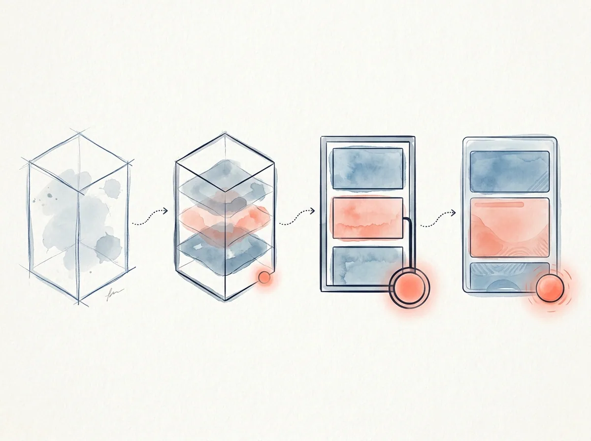
How to Show Wireframes in a UX Case Study
How to present wireframes in a UX case study through structure, flow, hierarchy, and design reasoning.

Ömer Arı
10 min read

Wireframes are often shown in UX case studies as “the screens I made before the final design.” A few gray boxes, a few flow screens, maybe a short caption, then the case study moves on to polished UI screens.
That misses the real value of wireframes.
A wireframe is not just a low-fidelity screen. Used well, it shows how you thought about structure, flow, hierarchy, user priorities, and decision points before visual design took over.
In a portfolio, the weaker message is:
I made wireframes before moving to UI.
The stronger message is:
I used wireframes to explore structure, compare options, clarify priorities, and test decisions before investing in the final design.
That difference matters. It can make the case study feel more thoughtful and less like a sequence of deliverables.
What is a wireframe?
A wireframe is a structural draft of a screen or flow before visual style becomes the focus. Color, typography, icon style, illustration, and brand expression are not the main concern yet.
The main questions are:
- What information should appear on the screen?
- In what order should that information appear?
- What should the user see first?
- What is the primary action?
- Where do secondary actions belong?
- What information does the user need before deciding?
- Should the flow be shorter, split, simplified, or explained better?
For that reason, presenting wireframes as rough visuals is not enough. Wireframes are decision spaces.
When do wireframes help in a portfolio?
Wireframes are useful when the design reasoning cannot be fully understood from final screens alone.
1. You want to show how you built information hierarchy
Many UX problems are not only about what appears on the screen. They are about what appears first.
For example, in a financial product, the most important information may be the transaction amount, cost, term, risk note, or next step. If everything appears at the same level, the screen becomes heavy. If the order is wrong, the user may struggle to make a decision.
Wireframes are a good place to explain hierarchy decisions.
Weak version:
I created the wireframe structure.
Stronger version:
In the wireframe stage, my first decision was to place the transaction outcome at the top of the screen. Research showed that users wanted to understand “what will this cost me?” before moving forward. I moved supporting details lower on the page and grouped decision-critical information in the top area.
Now the wireframe is not just a layout. It is a structural response to a user need.
2. You explored flow alternatives
Wireframes are useful for showing that you compared different ways to structure a flow before choosing one.
For example:
- One long form or multiple steps?
- Show key information before the decision or on the confirmation screen?
- Prioritize speed or explanation?
- Present options as cards or as a comparison table?
These choices are hard to explain with final screens alone. Wireframe alternatives can make your thinking visible.
Example:
In the first wireframe option, I placed all information on one screen. It looked shorter, but the explanation needed for the decision made the screen feel heavy. In the second option, I split the flow into selection and review. This made it easier for users to understand the choice first, then check details before confirming.
This shows what you designed and why you designed it that way.
3. You want to explain why the final design looks the way it does
Final UI screens may look polished, but the reader may not understand the decisions behind them.
The wireframe section can explain how you got there.
For example:
The summary area in the final screen came from three hierarchy options tested during wireframing. Users wanted to see total cost and next step in the same place before deciding, so we moved that information to the most visible part of the screen.
This makes the final design feel intentional instead of decorative.
When do wireframes weaken a case study?
Wireframes do not automatically make a case study stronger. Sometimes they feel like an unnecessary middle step.
1. They are shown only as low-fidelity screens
If you show gray boxes without explaining the decisions behind them, the section may not add much value.
This is weak:
Below are my wireframes.
This is stronger:
In the wireframe stage, I worked through three decisions: how to order information, how many steps the flow needed, and where reassurance messages should appear before confirmation.
This tells the reader what to look for.
2. There is no link between wireframes and final design
If wireframes appear but the final design does not connect back to them, the section feels disconnected.
In a strong case study, wireframes can connect to:
- Research findings
- User needs
- Information architecture
- Task flow
- Prototype decisions
- Usability testing
- Final design rationale
A wireframe is a middle point in a decision chain.
3. You show too many wireframes
It can be tempting to show the full working file. In a portfolio, that often creates noise.
A better approach is to:
- Select two or three critical screens.
- Explain what question each screen answered.
- Show alternatives only when the difference matters.
- Connect the wireframe decision to the final design.
A case study should not show the full wireframe archive. It should show your reasoning.
How to explain wireframes in a case study
This structure works for many portfolio projects.
1. State the purpose of the wireframe stage
Start by explaining why you created wireframes.
Example:
Before moving into visual design, I wanted to clarify two questions in the flow: when users needed decision-critical information and how much explanation the confirmation step required.
This connects the method to a purpose.
2. Name the decisions you explored
Instead of saying that you “made screens,” describe the decision areas.
Common wireframe decision areas include:
- Information hierarchy
- Form structure
- Number of steps
- Primary action
- Back path
- Error state
- Comparison structure
- Confirmation and reassurance messages
You can turn that into a sentence:
In the wireframe stage, I focused on information hierarchy, number of steps, and reassurance before confirmation.
3. Explain alternatives briefly
You do not need to describe every option in detail. Still, it helps to explain why one option was rejected and another was chosen.
Example:
The first option placed all information on one screen. It seemed faster, but it created too much cognitive load before the decision. The second option split the flow into selection and review. This helped users understand the choice first and check details before confirming.
This shows how wireframes helped you make a decision.
4. Connect the wireframe to the user need
A strong wireframe section answers this question:
How did this structure respond to the user problem?
Example:
Users did not want to continue without understanding the outcome of the action. Because of that, I designed the review screen as more than a final checkpoint. It became a reassurance step before commitment.
Now the wireframe is tied to user behavior.
5. Bridge into the final design
At the end of the wireframe section, explain what carried into the final design.
Example:
After wireframe testing, I kept three elements in the final design: the top summary area, editable review section, and post-action expectation message.
This helps the reader understand the final screens.
A strong wireframe section example
You can adapt this structure:
The goal of the wireframe stage was not to define the visual style. It was to test the decision flow. Users wanted to understand the outcome, cost, and ability to edit before reaching the final step.
I explored two flow options. The first placed all information on one screen. It looked shorter, but it made the decision feel heavier. The second split the experience into selection and review. This made it easier for users to understand the option first, then check details before confirming.
I used the second structure as the basis for the final design. The summary moved to the top area, editable details stayed in the middle, and the confirmation section included a clear message about what would happen next.
This makes wireframes part of the decision process, not just visual evidence.
How to present the wireframe visual
When you include a wireframe image, guide the reader’s attention.
Useful practices:
- Highlight critical areas.
- Add a one-sentence decision note under each wireframe.
- If you show alternatives, make the difference clear.
- Select a few representative screens instead of showing every screen.
- Emphasize areas that connect to the final design.
- Avoid tiny wireframe collages that are impossible to read.
Example caption:
Option 2 separated the review step from the initial selection. This helped users check editable information before confirming the action.
A caption like this connects the visual to the case study.
What can you show instead of wireframes?
Wireframes are not always required. Another format may communicate the decision better.
Task flow
If the main decision is about sequence rather than screen structure, a task flow may work better.
Information architecture diagram
If the problem is about grouping, navigation, or content structure, an IA diagram may be clearer.
Prototype flow
If interaction behavior matters more than static layout, a prototype flow may be more useful.
Decision table
If you compared alternatives, a short decision table can be stronger than a wireframe image.
Example:
| Option | Strength | Risk | Decision |
|---|---|---|---|
| One screen | Shorter | High cognitive load | Rejected |
| Two steps | Clearer | Adds one step | Chosen |
A table like this can make your reasoning easier to scan.
A quick checklist
Before adding wireframes to your case study, ask:
- What user problem does this wireframe respond to?
- What hierarchy decision was made here?
- Did you explore alternatives? If yes, why was one chosen?
- Is there a clear link between wireframes and final design?
- Does the visual make it clear where the reader should look?
- If you removed this wireframe, would the case study lose evidence of an important decision?
If the answer to the last question is no, you may not need a separate wireframe section. A short design decision note may be enough.
Next step
Before adding a wireframe to your portfolio, write this sentence for each screen:
The decision I was working through in this wireframe was…
Then write a second sentence:
This decision continued into the final design as…
When both sentences are clear, the wireframe becomes evidence of design thinking instead of just an early screen.
This article was created in collaboration with AI · Editor: Ömer Arı
Related reading
May 8, 2026
10min read
How to Show Information Architecture in a UX Portfolio
How to present information architecture decisions in a portfolio through user needs, content grouping, and navigation reasoning.
May 6, 2026
9min read
How to Explain Prototyping in a UX Case Study
How to present prototypes in a UX case study through assumptions, interaction decisions, test scenarios, and learning.
May 5, 2026
10min read
How to Show a Journey Map in a UX Case Study
How to connect a journey map to user problems, friction points, and design decisions in a UX case study.